10 Bland NFL Uniforms That Need Bold Facelifts

NFL franchises are cramming: the franchise tag window is upon us, while free agency and the NFL Draft are imminent. Hardly the first thing on their collective minds this time of year are the outfits they roll their teams out in on Sundays.
However, there are a minimum of 10 NFL Uniforms that need revamping. Teams like the Vikings, Ravens, and Lions don’t need overhauls (the Lions actually are getting one), but a refresh wouldn’t hurt.
For the marketing departments of these 10 franchises: while your front offices are busy building winning rosters, do your part and build a winning uniform.
Philadelphia Eagles
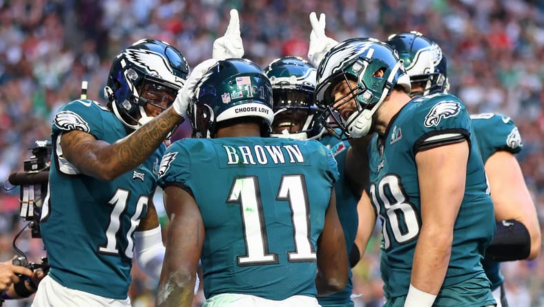
A little bit of kicking-them-while-they’re-down, but Philly’s late-1990s look is way overdue for a change. The over-extended serifs on the number font need to be chopped, and the deviation from the iconic Kelly Green and flying eagle was a mistake in the first place. The Kellys are coming back as a throwback in 2023. The Eagles would do well to reinstall them as the primary look.
Green Bay Packers

Deep-seated tradition will likely never allow Green Bay to make a change, but a refresh could really do Titletown some good. When Nike took over NFL uniforms in 2012, Green Bay never adopted the new uniform technology rolled out to the rest of the league. Why not at least improve the uniform material? Sometimes it’s tradition; sometimes, it’s stubbornness.
As for the color combination and uniform look, Green Bay’s green-and-yellow jerseys have become an eyesore in the age of modernized and improved on-field looks. The white-top-yellow-bottoms combination is especially bad.
Even if Green Bay didn’t want to tear it all down and completely modernize its look, they have two perfectly acceptable alternate uniforms (a throwback and a color rush) that could easily become the bases for a new combination.
It’s even more unlikely these changes will ever happen since no one actually owns the team.
Dallas Cowboys
Why doesn’t Dallas decide what shade of blue they like? The star is navy, and the jersey numbers are royal. Make up your mind.
Also, what’s up with the pants? Are they silver? Are they blue? Why do they look like my grandmother’s satin pajama pants?
There’s an easy solution here: move full-time to the navy and white alternate uniform combinations.
Chicago Bears

Unlike some of the other tradition-enslaved franchises on this list, Chicago is at least willing to make some flashy additions, as shown by the new orange helmet in 2022.
To start, Chicago could borrow some of Philadelphia’s serifs; their spaghetti-thin numbers have always looked incongruous from player to player. The color scheme is good, but the look is a little bland. Using the roaring bear as the primary logo on the helmet could be a nice change.
Like Green Bay, sticking with an already-in-use throwback could be the fresh look the Windy City needs.
Cleveland Browns

Cleveland, this is for you: scrap the orange pants. The staleness of the uniforms, plus the orange emphasis, give it an orange-jumpsuit vibe.
And put a logo on the helmet. Actually, maybe just start by having a logo. You’ve got a digital media and design team, right? With all the work to be done here, maybe it is time to hire a few more folks, too.
Atlanta Falcons

Anytime a franchise rebrands, it is an opportunity to reinvigorate the fanbase and potentially usher in a new era. With the end of the Julio Jones / Matt Ryan tenure approaching in the ATL, the Falcons rightly found it fitting to replace their Reebok-y uniforms.
And they faceplanted. The 1s look like 7s. The “ATL” across the chest is massive. The black-to-red gradient home uniforms look like they belong in an NBA All-Star Game.
And in an era where side panels are out, Atlanta has them in. The helmets are the only thing that works in their set.
Burn it to the ground and start over.
Los Angeles Rams
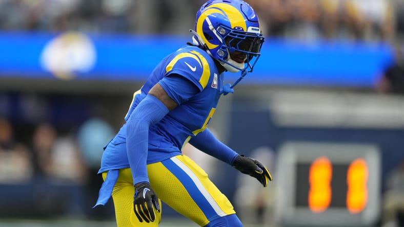
The move to LA left the Rams in between eras, as they kept aspects from their time in St. Louis but looked to incorporate facets of their first stint in Los Angeles. A rebrand was about as necessary as upgrading from Jared Goff, and boy, did they botch it.
As the new kid on the block in the city with the bright lights, they felt adding name tags to their uniforms was helpful so that people would remember who they are. To stand out even more, they decided not even to have a white uniform to begin with and went with an off-white “bone” color. (Thankfully, LA finally added a “modern throwback” look that had an actual, ya know, white jersey.)
And again, enough with the gradients.
There’s dignity in admitting failure and starting again.
Denver Broncos
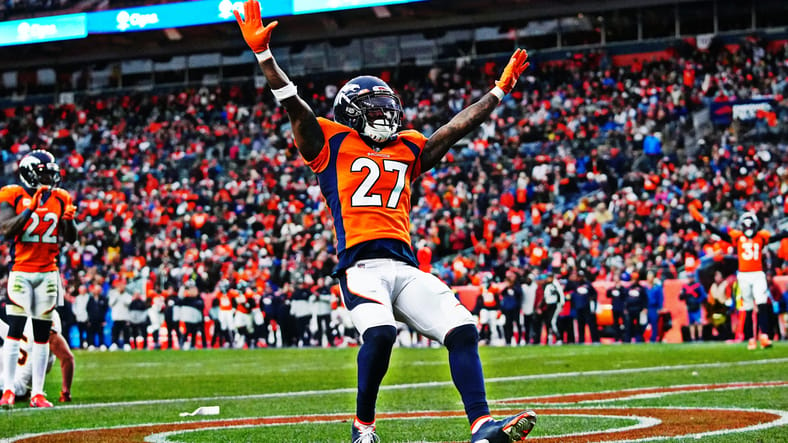
One of the best logos in the NFL is going to waste.
Denver missed a perfect opportunity to refresh their image with the big Russell Wilson signing in the 2022 offseason (maybe it would have helped the team perform better, too). Like Chicago, the orange and blue color combination gives them a lot to work with. And like Philadelphia, the Broncos are stuck in the late 90s.
The thick monochromatic side panel needs to go, for starters. Let’s make it simple: hire this artist and use his rendition.
Carolina Panthers
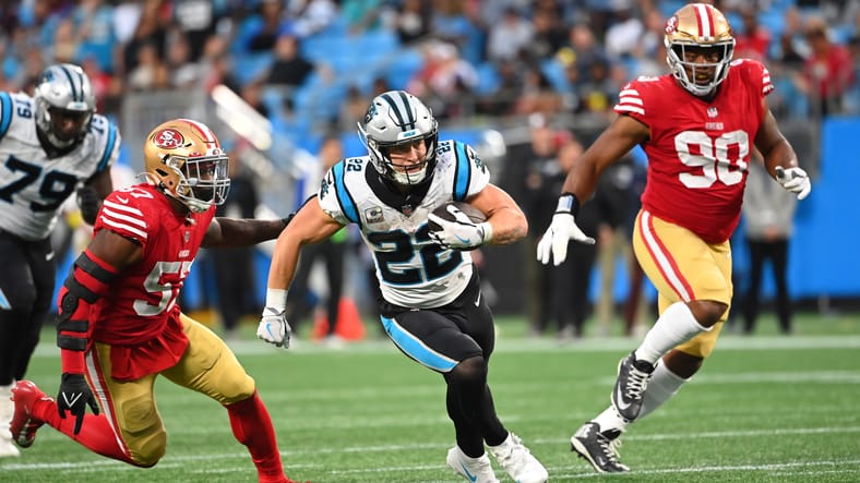
Elite logo. Electric color combination. Boring uniforms.
The shoulder stripe/circle things and silver primary helmets are misses, but overall, there is just a lot of meat left on the bone here. Starting over, featuring the Carolina blue as a primary uniform with their new black helmet could be a nice start. Taking a page from their neighbors wouldn’t be a bad idea either.
Arizona Cardinals

Everything just screams Reebok. And, home and away don’t mirror each other: the road whites feature red shoulder panels, while the home reds are graced with white armpit stripes. The thick, nuanced, swoopy side panels are far too reminiscent of the Vikings’ awful short-lived uniforms from the 2000s.
Please, when the rebrand does come, make the helmet red (like a cardinal head) and the facemask yellow (like a cardinal beak).
For fun: Pete Rogers, a graphic designer for SB Nation, created redesigned NFL uniforms for all 32 teams back in 2020. It’s worth a look.
Will is a husband, father, and earned an undergraduate degree in Economics (just like Kwesi Adofo-Mensah). Will’s favorite pastimes are water skiing, Minnesota sports, and Cinnamon Toast Crunch. He is the co-host of the Load the Box Vikings Podcast with Jordan Hawthorn. Follow him on Twitter (@willbadlose) and find his other sports content at Twins Daily and his very own Bad Loser Blog.
You must be logged in to post a comment.