Recent Twitter and Instagram debates over uniforms had me thinking, what are the Vikings’ top uniforms. For those unfamiliar with the current debate, some have photoshopped Justin Jefferson and Kirk Cousins into the uniforms donned by the Vikings from 2006-2012. While the idea is undoubtedly enticing, many pointed to nostalgia as the reason behind the support of these uniforms.
Had it not been for the likes of Adrian Peterson, Percy Harvin, and Brett Favre, these uniforms might just find themselves at the bottom of the barrel.
With that, let’s see if we can dive in and find out which uniform combination truly is superior to all others.
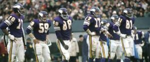
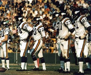
6. The 1961-1995 Threads


The 1970s design or also known as the Road Whites, were highly appreciated by fans across the nation. The clean white on white look provided a nice pop of the purple and yellow stripes on the pants, shoulders, and helmet.
However, the lack of modernity finds the original design at the bottom of the rankings. While the Vikings could incorporate some ideas from the design, it is simply not enough in today’s day.
5. The 2006-2012 Design
In 2005 the Wilf family took the reigns of the Vikings organization. One year later, and the Vikings had completely redesigned their look. A look that many, including myself, have grown up on.
Due to the nostalgia around the AP days and 2009 season, it appears fans forget how plain these uniforms truly were. The white numbering, in particular, looked like one of those old mesh practice jerseys you would wear for basketball games. The grey face mask was also shot down by fans, resulting in the 2013 change.
Overall, these uniforms land as high as they do simply due to the nostalgia around them.
4. Current Traditional Uniforms
It wasn’t until 2013 when the Vikings switched to the current threads, and boy, what a fantastic improvement it was. The matte finish on the helmets. The black face mask. The shorter sleeves on the arms. And most importantly, a crisper number design.
3. Current Alternates
The Vikings’ alternate uniforms maybe some of the best in the biz. Whether it be purple on purple or white on white, it’s one of the coldest looks in the league.
Unfortunately, the white on white is commonly associated with bad memories. Most notably, in the season opener in 2015 against the 49ers, the Vikings suffered a humiliating 20-3 loss.
Since then, the white on white is a familiar road look against the Bears, especially on MNF—Soldier Field and MNF; no wonder these uniforms are associated with bad times.
As for the purple on purple, this may be a personal favorite, thanks mainly in large part to the upset the Vikings delivered in 2019 in them.
2. Color Rush’s
Primetime Purple: nuff said.
1. Cream of the Crop
The Brett Favre’s and 1998 uniforms are the breadwinners here. Whether it be the redesigned throwback look inspired by Favre or the days of three deep, the shiny helmets and large font numbers will never be forgotten.
Forget the early 2000s uniforms; just imagine Dalvin Cook or Justin Jefferson in the OG throwbacks that Favre showcased.
Time for New Ones?
As mentioned before, the current Vikings uniforms rank near the top of the list in Vikings’ history. Given that teams around the league tend to view uniform changes as a way to generate hype, typically from teams that don’t have a lot of success (i.e., the Bengals), it seems unlikely the Vikings make a switch any time soon.
However, suppose the Vikings wanted to generate more hype from their fans. In that case, it could be an excellent idea to consider utilizing the alternates uniforms and even the hybrid throwback Favre modeled. Especially for prime-time games, the use of an alternate uniform is an absolute must. Create as much excitement around the game as you possibly can, and more importantly, keep fans as happy as possible with the current uniforms.

