New Norseman: Vikings ‘Redesign’ Logo
The Vikings “Norseman” has been the team’s logo since it’s creation in 1961. That makes the iconic mark of the Vikings over 50 years old. Remarkably, the logo managed to never look significantly outdated over that long stretch of time; something that is indicative of good design.
Yet, the Vikings organization decided that it was time for the Norseman logo to receive a [very] slight overhaul to bring it into the 20th century and update the look of the team.
Don’t be scared. I’ll be the first to admit that when I saw the headline I held my breath and continued on to see the change very cautiously. Usually, redesigns of iconic, traditional logos just end badly.
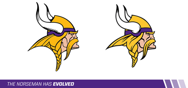
When I saw the ‘redesign’, I was relieved. Not much changed… And if you just glanced really quickly at it, the normal eye may not even be able to tell the difference. Here’s both the old and new mark:

Vikings.com defined the new logo as a “more natural and defined look” and an “improved appearance.” They also list out the five biggest alterations:
1) Horn Shape
The shape of the horns has been adjusted and the shading in the horns has changed.2) Horn Base
The base of the horn now resembles the horn on the players’ helmets.3) Face Detail
Thicker lines have been added to the mustache and face.4) Vikings Gold
The Vikings Gold is now brighter and less brassy.5) The Braid
The braid has been shortened, resulting in a reduced logo height.
According to Vikings.com, the organization wanted to update the logo before it was used seemingly everywhere over the new stadium. They also hint very subtly that these “enhancements are just the beginning” and the new logo could be on merchandise as soon as March. (New uniforms anyone?)
Personally, I like the redesign. It is a little more sleek and modern while still keeping the traditional look of the Vikings. I like that the profile comes off as a little meaner and more intense. I also like the bolder more stylized lines.
What about you all? Like the ‘new’ look?

You must be logged in to post a comment.