Is it time for the Minnesota Vikings to get new uniforms?

Is it time for the Minnesota Vikings’ to get a new Look?
The Vikings have been pulling virtually the same look now for seven years in a row. Although the team has not disappointed with their gear, some fans are wondering if it is time the team considers some redesigns, especially as other NFL teams have rolled out some surprisingly cool new uniforms this off-season. Looking back to their history, the Minnesota Vikings have plenty to learn regarding how various looks have been received by the fans but at the same time they are lucky in that they have A LOT to work with in terms of any potential new design(s).
The big question that comes to the mind of every NFL uniform designer is whether to go old school or embrace the more modern looks that some teams have embraced (albeit, IMO, more often to their detriment than their benefit as they can end up with XFL-esque designs (I’m talking XFL 1.0)). Teams like the Atlanta Falcons and the Los Angeles Rams seem to subscribe to a more modern look in their new releases, while the likes of Tampa Bay Buccaneers have opted for their throwbacks.
Finding the right balance between the oldies and the modern look can create a stunning new look for the team, something I’m sure those of you reading this article have seen from the stream of jersey/helmet concepts that have filled this news-lite off-season (something I’m guilty of, as well… But I mean, look at this concept and tell me that that doesn’t tickle you somewhere you didn’t even realize existed until just now:

Image courtesy of a future I’d love to live in…
Or, look at this amazeballs design:
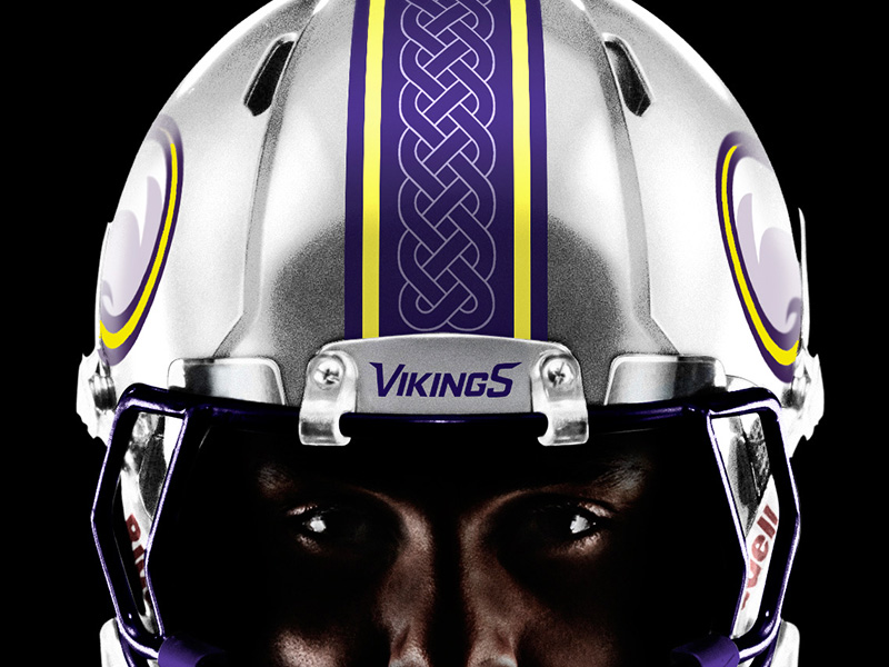
You can’t unsee that amazing middle section
So… Let us take a look at some of the previously donned gear for Minnesota Vikings that can be an inspiration for a new look.
The 2006-2011 Design
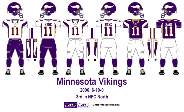
If you have been following the Minnesota Vikings since they joined the NFL then you know the team has rarely opted for radical re-designs. The 2006-2007 redesign may serve as a backline to what extent the Vikings should go in redesigning their look, or rather, what extent they shouldn’t go as those jerseys were objectively Arena Football-y. Many fans have termed this design an epic fail and it’s obvious because those awful jerseys (that we have to pretend don’t exist each time we want to watch Favre do his thing in purple) were replaced relatively quickly (in terms of how often the Vikings change their garb) and their designer, hopefully, was shot into space so he could never ruin a team’s aesthetic again.
When the Wilf family took to the helm of the Vikings in 2005, the ambitious family opted to bring new changes to stamp their mark on the organization. One of them though was redesigning their look. Perhaps it was a weird time to redesign jerseys as other teams had bad redesigns in the mid-00’s. I guess, considering, we should just be happy that the Vikings pants didn’t have cargo pockets or some sort of vibe you’d only find at a Coldplay concert.
The side panels for example were supposed to line up during games to make this sleek design. The result? Th side panels barely lined up and instead the look just looked cheap and sad, like a 2020 Coldplay concert. This design will undoubtedly serve as a warning to the Vikings on how far they should go with their re-designs. A new look may be imminent but this flop should always be a good lesson.
The 1970-95 Design
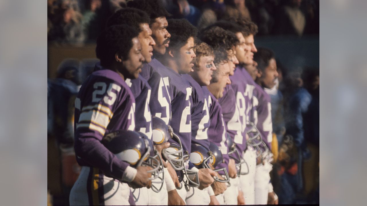
The 1970-75 design otherwise termed as the Road Whites were highly welcomed and is still a fan favorite. It was a classic white on white look that blended well with the purple and yellow stripes on the shoulders and helmet. The last time Vikings graced the pitch in white on white is the kick-off game for the NFL 2015 campaign. The Vikings suffered a humiliating 20-3 loss in the hands of 49ers and you can easily see why this design was thrown on the trash heap (albeit unfairly, if you ask this old, old bastard).
They also ditched the 1997 “Dairy Queen” Jerseys after only two games of that season. Nevertheless, the white on white new Nike look could be amazing. They can keep purple and white stripes on the shoulder to match their tradition since 1970. They can even get rid of the yellow trim to the numbers and retain the old school block numbers. In general, going back to the Road Whites might be a good option for the Vikings in a new look.
I can’t find a new looking white/white concept online, but this should give you the general idea:

The 2007-2011 Design
If you don’t know the term “Brett Favre Jerseys” then you probably don’t know about the 2007-2011 design. Yes, this term cropped up during the 2009 Packers Monday Night Football match that took place at the Metrodome. Although it falls under the epic fail design of 2006-2011, it looked more of a hybrid design that was so disjointed that the Metrodome gave up and collapsed into itself in the hopes that it’d create a blackhole strong enough to suck those jerseys into its event horizon.
The purple and white is a good combination. However, their white numbering has some critics who believe it is a bit plain and that something could be done to improve the look (which the team clearly listened to). The designers can look back on how the 1996 gold trim to the numbers backfired, though. Back then, the numbering appeared as though the Vikings donned the misprinted Kansas City Chiefs uniforms, which, were actually one color before Dick Vermeil cried all over all of them.
Going back to their throwback block numbering may not give the best look but will surely add something to the general design. On the helmets, many fans still felt that the grey face mask was “Meh”, something the team clearly also listened to.
The Current Jerseys
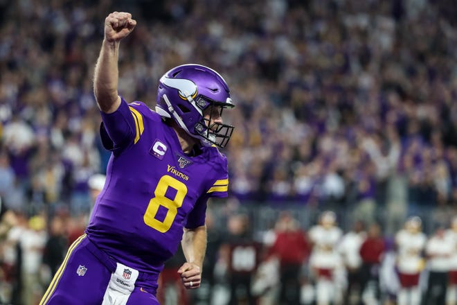
The current Vikings uniforms are a VAST improvement over the Brad Johnson/Chester Taylor iteration, or the tweaked versions they rolled out a few years later.
My personal favorite is the purple on purple with the yellow numbering, but they all look nice and clean. That’s the problem, or one of the problems, with the early Wilf-era jerseys in that they just had too much going on. The Vikings are an NFC North team, the black and blue division. We play against teams that started back in the leather helmet days and that have kept strikingly similar jerseys since their inception.
The only thing that I would advocate outside of the current design (because I don’t trust the NFL to not get too busy) is going back to the original look of the 60’s (albeit with some small differences as jerseys are no longer arm length and helmets these days have different indents in them). That matte paint on the helmets, for example, could go.
But I’m just being picky.
That having been said… Look at how DOPE Favre looked in the OG gear. I’ll just leave that as my final argument as we get into the wrap up…

Wrap up
The Minnesota Vikings don’t look that desperate to release any sort of new look soon, despite that fad sweeping parts of the NFL and the team being on the precipice of (or one-half off-season into) a rebuild.
As previously stated, teams that don’t have a lot of success on the field tend to redesign jerseys to get some, any hype or excitement from their fanbase. Or, like the LA Chargers, who have no fans, they instead are just happy to be able to afford jerseys for their team.
That said, most fans believe that keeping the same design for a long time isn’t that great of an idea, as many like to opt-out of buying the same style of jersey over and over again. That impetus also leads NFL teams to switch up their looks to boost their jersey sales, although you’d think one or two good drafts could also solve that problem.
Of course, as fans, we get to that point where we need a new look to ignite and create a buzz. Most fans don’t necessarily want a massive overhaul in the design. Perhaps a good mix of modern and throwbacks cues could create a new look that focuses on some of the elements that the Vikings looked at when designing their original look back in 1961.
In the era of COVID and civil unrest, it might be nice for us Vikings fans to see a helmet/jersey that feels cohesive, and that represents the best of what Minnesota has to offer. While it may be tone-deaf to add blonde pigtails to a helmet (as seen above), considering, (unless that helmet belongs to the punters only to go along with their single barred helmes and shoeless left feet) there are still elements of what it means to be a Vikings player/fan that could be incorporated, as well, that’d be a nice reminder that despite all of the divisions we’re seeing in terms of social interaction period or in terms of other social issues that have lead to our biggest/best city to burn, we are all in this together.
That having been said, I’ve never been the type to advocate for change just for the sake of change. I do think that the current jerseys/helmets are much improved over the last iteration, although the child in me does miss the shiny purple helmets from my youth just like I miss the smell of stale beer and the feeling of cheap plastic against my ass meat that came from the Metrodome. So, perhaps I’m not the best person to ask about this in the first place.
With that, I’ll add some other concepts I’ve come across for you to consider in this photo album:
You must be logged in to post a comment.